- cross-posted to:
- news@lemmy.world
- cross-posted to:
- news@lemmy.world
cross-posted from: https://lemmy.world/post/35057012
You must log in or # to comment.
I wish these people cared as much about the president being a pedophile as they do about this mid-ass restaurant changing its logo.
They need these distractions, otherwise they start to actually think. Their leaders can’t have that happening.
So it’s a good thing CB is changing back
Its not even political at all. It was just dumb corporate blandness that defeats the purpose of the restsurant’s image. Conservatives made it political because their CEO happens to be a woman.
McDonald’s and taco bells used to look so cool, now everything is corporate and bland and sterile. Chain Restaurants all look the same now
What happened to McDonald’s? Apart from maybe a slight font change, it’s the exact same thing from 70 years ago.
Also, Burger King is an example of ditching a trendy look and going back to an older, more timeless logo.

I think they’re talking about the restaurants themselves. McDonald’s used to have some wild interiors!
They’re referring to changes like this:

Have you ever been in a McDonald’s in the past 50 years?
Step 1: Get a terrible rebranding done
Step 2: Wag the dog with fake/paid outrage
Step 3: Reverse the decision letting people think they’ve won
Step 4: Profit
It’s New Coke all over again.
honestly I thought it was this too
The new logo is pretty terrible. I bet they paid a lot to some consulting company for it and when they saw how bad it was they wanted to at least try to get some benefit from it.
It’s literally simple. It’s just boring not bad
It’s just boring not bad
This has been the theme of every area of design since 2015. Cars, buildings, logos, websites, interior design; everything is not necessarily bad but really boring.
Step 2: Wag the dog with fake/paid outrage
I see conspiracy theories everywhere
Conservatives are calling this a win? Really???
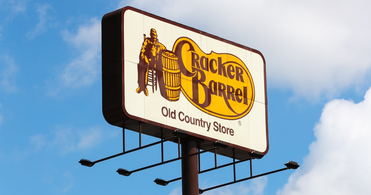
Cracker Barrel: Changes logo.
Me: Didn’t even know this happened months ago. Thats how little I care.
Conservatives: WE WILL FIGHT FOR A FICTIONAL OLD WHITE MAN’S RIGHT TO EXIST IN A LOGO!!!
Me: Still doesn’t give a shit.
Cracker Barrel: Changes logo back.
Me: Still doesn’t give a shit.
Conservatives: WE WON!!!
Me: STILL doesn’t give a shit. You’re the winner of a game that no one wants to play.
Bland logo? Not okay. Bland food? Totally fine.
Goddamnit stop teaching conservative snowflakes that their annoying, incessant whining works sometimes!
I mean, its cracker barrel. That’s their entire customer base.
Republicans are sensitive snowflakes
After a bunch of free advertising, what a shocker!
I said it in the last thread and I’ll say it again here: I do not give a single flying fuck about any political motivation behind the changing nor changing back of the Cracker Barrel logo, either real or simply perceived, but their new logo was objectively terrible. It was so bland and unmemorable that whoever designed it should have their Macbook confiscated and be catapulted into the ocean. That is, the both of them. But preferably one each into different oceans. I don’t know how much that braindead rebrand cost them in consultancy fees but I hope they can ask for a refund.
bland and unmemorable
This is why it was great. It perfectly encapsulated both their food and store. It was an ideal logo for them.
I guess it’s easy to win a culture war where you’re the only belligerent
And everybody forgot about the Epstein files and we all lived happily ever after the end.
Good thing this “controversy” came along, I’d all but forgotten the place exists.
A new logo wasn’t going to change the fact it’s a racist restaurant chain so it’s fine by me of they keep the old logo, not like the new logo was going to get me to break my twenty plus year streak of avoiding this place.
Put the old man back in, but add another man standing behind him with his hand on the first dude’s shoulder. They’ll flip their shit even harder.
Whiny snowflakes got their way and now see that they can threaten more businesses to cater to their WEIRD ASS COMPLAINTS