

You must log in or # to comment.
Show this map to Trump. He will not want Greenland anymore.
Acquiring Greenland would move the USA up 2 places in the list of largest countries (past Canada and China). That’s probably why he wants it.
He just wants it ti deflect from the Epstein Files.
It is quick becoming a very important strategic hub in the Arctic due to shipping lanes opening up due to global heating. Greenland is also continuously opening up to natural resource extraction as ice disappears, and they have vast quantities of a lot of very valuable shit under the ground that keeps getting easier to access for the same reason, like rare earth elements, oil, natural gas, copper, gold, zinc, uranium, lithium, tungsten, the list goes on…
Controlling and exploiting that land is a major strategic interest for all the big (and small) powers. That’s why he wants it, and everyone else too. Fuck his fat fucking ass though.
The dissonance with Trump is astonishing. The Arctic is recently becoming more important strategically due to ice disappearing, and yet he’s one of the biggest and most stubborn climate change deniers.
Wait till he finds out it’s not green at all!
He knows it’s all ice. That why it’s called Iceland.
Greenland: I was in the pool!
There’s shrinkage!
This post didn’t need to include an ad for x-dot-com.
Ragebait


Tbh any discussion of Mercator is ragebait enough. (There’s no better choice for slippy maps btw)
I don’t think that’s the true size. You’ll find all those countries are actually a lot bigger than presented on that map and scaled down to fit on a screen
Hmm, so the Mercator projection makes things look larger than they are? I think I’ve got an idea for another use for it… 😏
Is that it?

Your penis isn’t far enough north for it to help
All right, well first I may need to see a doctor.
Yet
Slightly enlarging something that is microscopic doesn’t change much.
10 x 0 = 0
Yes, but blue (Mercator) preserves direction and shape, which were all that really mattered for navigation by sea, so Mercator was a fantastic projection for centuries.
And we still use it today for smaller scale areas, since it does a remarkably good job at preserving all 4 features (shape, area, distance, and direction) close to the map origin line. Universal Transverse Mercator is a system that has 60 zones of Mercator turned sideways.
The reason it’s Transverse is because, unlike lattitude depending on a defined equator, longitude has an arbitrary meridian, so by turning the map sideways we can move the distortion point, and any map area that doesn’t stray too far East or West will be very accurate.
Think of trying to map something like Chile or Florida, where the area of interest is pretty far North to South, but not East to West.
How much do you wanna bet Trump wouldn’t be so gung ho on Greenland if he saw this map? He probably thinks he is going to double the size of America.
Can they spot grrenland on the map tho?
Trump handlers want the resources. Trump wants it because his ego is inflated by mercator projection.
Eh, I doubt that’s the case. It could be a 20 m^2 area, but if it had Greenland’s resources they would want it.
There also an interactive version of this, also a bunch of copies (not sure if this is the original, but i believe so): https://thetruesize.com/

Maybe show this to taco trump and he’ll realize Greenland is small and
levelleave it be.Edit fixed typo
level it
INSTRUCTIONS UNCLEAR, ICBM SEQUENCE INITIATED
☢️🚀⤵️💥🌇
(You made a fatal spelling mistake, you killed Greenland, its all your fault!)
Instructions nuclear
Why is the difference only extremely pronounced in the northern hemisphere? If I understand the math behind the projection correctly, the equator should be true scale, and things should vary more the further north AND south you go.
This image shows the extreme southern latitudes to be almost equal to their true area. Is the image wrong, or am I misunderstanding something about the projection?
This map is clipping a good chunk of the Southern Hemisphere. When you include it, you also notice the same distortion:

Note how it looks like Antarctica (14*10⁶km²) is 1/4~1/5 of the globe, even if it’s actually smaller than South America (18*10⁶km²).
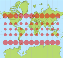
Did it cut out the European portion of Russia?
No, it just can’t be scaled down and somehow kept in place at the tame time
TL;DR Somebody made an awful mistake rendering this map, it’s way too low-poly.
It’t not exactly the European portion but most of its recognizable parts (Kola peninsula, Caucascus…) are missing because of the horrible SVG compression that deleted vertices presumably by count rather than keeping the most significant* ones. Just look how the Mercator/shrunk versions differ from each other and from an actually good map! Not even they will show every fjord of Iceland but at least they won’t reduce it to a triangle!
* A simple illustration would be Colorado, originally defined as a (Mercator) rectangle (between meridians and parallels) but ending up a 697-sided polygon (still way fewer than most surveyed administrative areas that size) largely because of surveying errors. However, if you pick the 1ˢᵗ, 175ᵗʰ, 349ᵗʰ and 523ʳᵈ vertex (or points every 362 mi/582 km along the border), you don’t approximate the shape nearly as well as by picking the 4 corners of the defining rectangle.
And because corners are always mostly convex (they have to be because turns add up to 360° for closed areas), this compression will remove area more frequently than add it. This makes the map quite disingenuous (maybe not intentionally), as it amplifies the effect OOP was trying to show.
If I were a full-time Lemmy commenter, I’d download the Colorado polygon from OSM, import sone geo-libraries into Python and do all 174** combinations of picking the 1ˢᵗ, 175ᵗʰ, 349ᵗʰ and 523ʳᵈ vertex, visualize each quadrilateral (with great-circe edges) as a video frame with its area printed in the center.What Colorado might look like using an algorithm similar to OOP’s:

(Manually created single frame but accurate to the number of digits shown. Also, I actually used every 228ᵗʰ of the 912 OSM waypoints, which are sometimes redundant (colinear), which I didn’t bother to check.)
(Edit: maybe official government geoJSON would help? The best files are “500k” or “1:500,000 resolution”, and even they reduce Colorado to 357 vertices. The complete dataset is probably https://www2.census.gov/geo/docs/maps-data/data/grfc/public_grfc_cur25_08.txt (50 MB text file!); see also legend and FIPS but that is for all Colorado’s counties, I’d have to merge the polygons and maybe also remove any non-polygon data if there’s any.) ArcGIS says they processed the data but they probably left lots of redundant colinear points in, since there’s 1565 vertices in their dataset.** Technically 697 options because 697 is not divisible by 4. But only ¼ of them are fully distinct, as every consecutive 4 maps have an identical starting vertex and just differ in which pair of vertices is 175 apart as opposed to the normal 174.
How can it be the true size if it’s still a projection on a 2d surface? I thought could only see the true size on a 3d globe.
True size is possible just fine on a 2D surface. For both too large and too small to be even possible there must exist some transitional point where the size is correct.
You cannot have both the size and shape correct at the same time. Having the correct size means distorting the shape, and vise versa. One or the other can be correct, but never both.
It’s a curved 2d surface


