
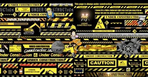
Kids these days will never experience every web page looking like this.
Kids these days are making neocities pages again
neocities is where it’s at.
I love that. The enthusiasm of someone who can write 15 pages about penguin migration or medieval catapults is infectious.
I saw one quite recently, I think it was from a client but I’m not 100% sure if it was not randomly
No one seems to know exactly what “modern” means when it comes to “modern design”. If you ask ten different developers, you get 11 different answers.
My rule of thumb when I see “modern design” touted as a feature is that the developer chose form over function at every turn.
That is a good definition. As an ex-website designer, I hate the new formats with their bloated flow and flashy appearance while the content is everywhere. Give me some tables and preloaded image sizes so the page loads fast and stops jumping all over the place.
And they all look the same. Maybe because everyone just grabs the same template and there aren’t any out there actually trying new looks.
As a current web developer I’m with you except for the tables. I hate tables with a burning, fiery passion.
I do like responsive design to account for mobile, tablet, and desktop so I try to blend that with classic “just works / just here for the data” layouts and generally minimize the flash in favor of the content. In other words, my projects go to a lot of work to look that simple lol.
I know, divs are better, and I did use them once they came about. But tables were what you used back in the beginning, had to.
I appreciate responsive design, there’s some brilliant things out there. And I got out just as the whole smart phone thing started, and THAT was a nightmare that made the browser wars simple by comparison.
I remember tables, if you made the webpages in Publisher it would be tables all the way. I tought it was quite the thing back then, I guess 20-25 years ago?
YES! THANK YOU! I fucking hate these new website that look like they cost a million dollars to design, but they don’t function for crap, it’s hard to find the information I need, it jumps around while different “features” load, and keeps doing unexpected things while I scroll or hover over stuff.
Give me a nice, clear side bar with submenus that make it easy to find what I’m looking for, and pages that load quickly and behave statically until I click on something.
Fuck this emphasis on “modern” design. That’s just a bunch of self-fellating rich people getting off on marketing and sales pitches while ignoring user experience…
I cannot explain the amount of rage I experience when a website makes my scrollwheel do anything other than simply scrolling down, i.e. scrolling sideways or needlessly trying to do cool animations that just end up looking like shit
“just use tailwind” or any of the premade shit. It’s everywhere. Everything looks the same. I hate it.
No one wants to design a website anymore. They just want to make one as fast as possible.
“Modern design” somehow seems to mean “flat gray, bland logos, and simple block letters” to an unfortunate proportion of the marketing/design industry.
Like why do so many companies spend millions on rebranding to these dull husks of what they were? Do they think that’s going to convince people to spend more money there?
No one thinks “Oh look, Qdoba’s logo is much simpler and modern! I should eat there more often.” If anything it alienates the loyal customer base, like you see with the cracker barrel blowback (not that cracker barrel customers are worth their loyalty, but I digress).
Billionaire shareholders and C-suite corpos are so out-of-touch it’s not even funny…
And the trend of that same design trickling down to FOSS projects because “that’s what people want, apparently” is also (mildly) infuriating.
I notice FOSS tends to give you more options, because anyone can fork something or contribute to a project and add the features they want. Corporations try to force their “vision” on everyone who doesn’t want it, but FOSS projects let you own your own operating system and configure it how you want.
Yeah, some of the bigger projects seem to follow corporate trends, because they’re mostly run by is non-profits very similarly to a corporation, and they need to appeal to a large base to get people to switch. Canonical even has for-profit motives, but if you’re not using Ubuntu/Gnome then you don’t need to give a shit what canonical does.
I was originally going to choose Zorin, but I decided against it specifically because I didn’t want anything associated with Ubuntu. I considered LMDE, but I went with Endeavour and I’m happy with my choice.
I’m pretty sure that whenever someone refers to “modern design” they mean winamp 3 skins, which came in all kinds of crazy shapes. Your imagination was the limit. Well, that and any technical limitations it had.
I also blame search engines. I type like “python file open parameters” and I really just want the official docs. They’re not even on the first page of DDG.
6 Reddit threads, a bunch of YouTube videos of people with shocked faces (why are they surprised?), an AI summary that may discuss something related to your query or may talk about ways to get a snake to open its mouth, several articles, pretty much anything except the reference manual.
I think the next underground social network should be called “car insurance.”
Nobody would ever find it through a search engine.
Fantastic
THESE 10x DEV TRICKS WILL BLOW YOUR MIND!!!1!!1!1!1
10 best python file open parameters
2026 best python file open parameters
You won’t believe how the sixth one will halt!
On my free trial of kagi the official docs are the very first result without any lenses or settings. I will be buying subscription soon because while not always but sometimes the results are better by a long shot over ddg and google for me.
I’ve heard good things about kagi, but $10/mo is pretty steep
Trust me, I thought the same, but its honestly almost life changing. Takes me right back to 2008 internet where I could find the shit I wanted. Very little seo and slop.
Kagi, mullvad, ublock origin with huge AI and ad blocklist waterfox (or Firefox) and private DNS are MUST HAVES to use the internet today.
Try the 5 dollar kagi first.
Hello, what do you mean when you say private dns?
Either mullvad DNS or nextdns.
Mullvad DNS is free for anyone to use. You can either change it within mullvad or in your network settings on your device or router. Pm me and I can help ya.
Basicakly results in less tracking and ads. Sometimes better network performance.
Lemming nerds correct if I’m wrong !
Oh that makes sense. Thanks. I was confused.
If you have a subscription to Windscribe, addy.io, or one of Kagi’s specials, you can get 3 months for free.
Most people have at least one subscription that they don’t use that they pay $10/mo or more for.
I’m an outlier I guess. I don’t think I have any subscriptions.
we’re on lemmy (or piefed, or whatever). Everyone here is outliers.
Google Kagi 

Yesterday, one of our new devs was struggling to get the page count of a word file in Python. I asked if he could just use an index from one of the existing libraries we’re using. He proceeded to search it on Bing and then waited for Copilot to generate slopcode at the top of the page. Shocked in horror, I asked, “Are you sure these are real functions?” He responded, I’m sure I can just copy and paste what I need. FML
Here you go: https://kagi.com/smallweb/
A curated list of small sites and blogs
Cloudhiker.net is another Stumbleupon clone. also Ye Olde Blogroll for finding indie blogs (blogroll.org)
Micro.blog and bearblog.dev both have great communities too, if you’re into blogging.
and finally: check out neocities, it’s like geocities but still alive
We love Neocities! :3

TELL ME YOUR FIVE FAVOURITE GREENDAY SONGS
my website is very basic (just a simple static website with text and sometimes images) - but at least i have a handmade 88x31 button :3

I love me a good 88x31 button, well done
This person would love to spend an afternoon on neocities and see what people are still creating
Seems to be mostly blogs, not old school Geocities-style sites.
I never liked web 3.0 for the most part. Bloated trash. I’ll take pure HTML any day.
We need lines and boxes to not get lost. Structure it is
I feel safer when I see IFrames and text and blue (sometimes purple) links than I do when everything’s shiny and slidey and has an alpha of less than 255.
Bring back the blinking text and MIDI music honestly.
Reading blogs on bearblog.dev is an amazing experience. No algorithms, no discourse, no AI slop (I mean, hopefully 😬) and a majorly decreased amount of depressing world news.


