What a complete waste of time and energy.
Worse than that. They made this decision because it’s easier to read for people with dyslexia. So a waste of time and energy just for the sake of being a dick.
This is what they spend their time on. Not solving issues. But complaining about fonts. Bro the child poverty rate is up 50%
deleted by creator
And you know these fucks spent 12 meetings, and $500k on this decision.
Whatever keeps the gay thoughts away
It’s because it’s got Roman in the name, isn’t it?
It is because Calibri was made with reading inclusion in mind (no thin slanted lines) and the current office actively working to exclude as many people as possible for no obvious reason other than pettiness.
Although, maybe they want to start writing in latin one day again too, so to exclude even more people (like the old days when only the elite were able to read relevant sources).
No they want to start using Latin so that they can have interpretations based on vibes of the day and not the letter of the law.
It’s because it’s got Roman in the name, isn’t it?
also Calibri is a humanist sans-serif font
Standard insecure loser behavior.
Isn’t it just being petty and vindictive for no reason but hate? Biden brought it in, therefore it’s bad, and people who have difficulty with serif fonts? Well, that’s just DEI wokery, according to this feckless wretch.
Serif for print media, sans serif for screen media. That said, waste of money even if Calibri is ugly (which the creator of it also said).
Personally I dislike Times New Roman, it’s cringe
deleted by creator
Well put
Guys, is it gay to not use serifs?
No, it’s trans.
This is the kind of divisive policy that will Fraktur the nation.
Fraktur vs Antiqua II: elektrisches boogaloo
Bold magenta comic sans would be more suitable
deleted by creator
Just wait until tomorrow.
Can we at least use Arial instead? I don’t like serifs
Gothic thanks. If it was good enough for Jesus Christ then its good enough for me !
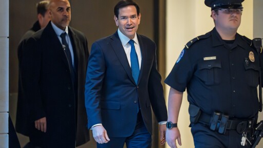
Well shit, that sure did own me. Totally worth it, Marquito!
We should help them look for the old font. Release the Epstein files so we can proofread it for you.